Making accurate, data-driven decisions is important in today’s rapidly changing business environment. In order to do that, however, you need a great reporting tool and a well-designed dashboard view. Quickbase recently released a powerful update to their dashboard functionality that goes far beyond just offering a prettier design and easier development experience.
It’s not hyperbolic to say that the new Quickbase dashboard features will revolutionize the way you see data, work with data and report on data in your Quickbase app. These updates offer tremendous potential for leveraging data across all of your applications, cutting and filtering information in ways that previously just weren’t possible.
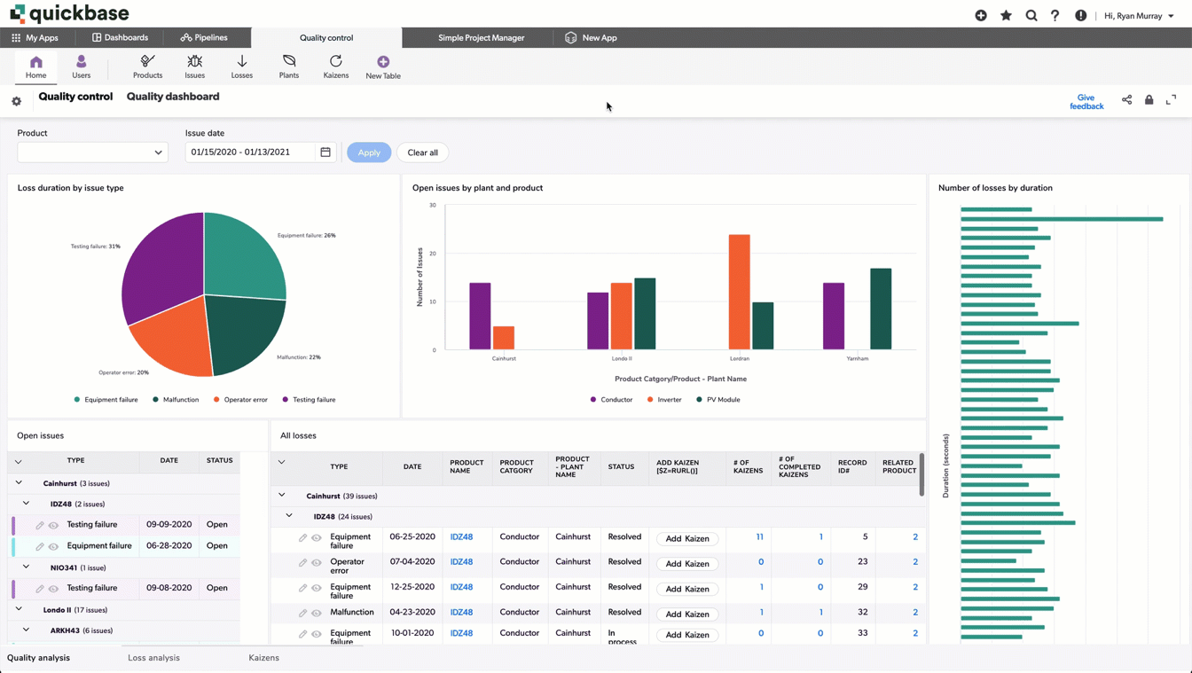
The new Quickbase dashboard features allow you to customize how your data displays in easy, at-a-glance views that can be filtered and updated with extreme precision. They’ve added filters, side-by-side reporting options, modern visualization displays, detailed drill-downs, adjustable views and more – all of which radically alters what you can do in your Quickbase app.
New Dashboards Mean New Opportunities
Prior to this release, users had to create separate dashboards for separate data points, even when working within the same segment of a database. For example, there wasn’t necessarily a way to quickly compare month-by-month labor availability or compare segmented sales reporting. You had to either create separate dashboards or pull data into a spreadsheet. This was often cumbersome and made it difficult to quickly compare metrics and make decisions. But all of that has now changed.
Importantly, the new features aren’t just a means to make your existing dashboards better looking. Rather, this update is an opportunity to fundamentally reconsider how you’re using data within your organization. You can get real-time insights from data no matter where it exists in Quickbase. Information is no longer siloed in the way it once was. Moving forward, you can see and filter data from your project management app right next to your sales app. Filtering along the same criteria, you can instantly create side-by-side comparisons to help you make business decisions. If you want to see your project profitability from May–July, you can see that all in one place, right next to your sales numbers for the same range. This makes the dashboards themselves vastly more flexible and the information more useful.
Consolidating your existing dashboards and hopefully reimagining them entirely, you can now re-think, simplify and redesign what you’re currently using Quickbase dashboards to do. The following are just a few use case examples of ways you might leverage the new dashboards to make better business decisions. The options are limitless.
Make Better Sales Decisions
With the new dashboard features, you can filter sales leads by status and instantly update different reports as well as see the data at a glance. Previously, the only way to handle this was to have separate dashboards – one dashboard showing all new opportunity leads, one for those in the pipeline, one showing those you’re actively working, etc. All of these were mapped out across different dashboards, and while you might have had a button to navigate across these separate dashboards, the information wasn’t easy to display side by side.
Now, you can consolidate and compare all that data in one place. With a few simple clicks, you can compare all of your sales leads within a particular date range or look at data year over year. This might help you identify where in the sales funnel potential leads are getting lost, where your most valuable leads are coming from, and any number of other valuable insights. Importantly, a new dashboard will allow you to look at your sales information holistically and make decisions without having to compare spreadsheets or have multiple windows and separate reports pulled up.
Forecast Labor Availability
Previously, if you wanted to get a sense of your team’s availability across several months, you would have had to download monthly reports into spreadsheets and try to cross-reference that data. Managing your labor availability may have involved a lot more guesswork and ballpark estimates than was ideal. However, the new dashboards will allow you to drill down to just how much availability you realistically have when bidding for or taking on major projects.
For example, say you have the opportunity to take on a project in the next few months that will become increasingly labor intensive. With a new dashboard view, you can look at all of your people and drill down to who might be available to work on it. You can quickly identify everyone on your team who has 10 hours next month, 50 hours the following month, and 70 hours of availability for the third month of the project. Once you know who is available, you can make decisions about who will be the best fit.
Being able to quickly view your labor availability like this will not only help you identify the right person for the project in question, but it will also help you keep an eye on how you are leveraging the people on your team. Comparing their availability across months, you can quickly identify if someone is being underutilized or someone else is being overtapped.
Consolidate Financial Data and Assess Revenue
The new Quickbase dashboard features allow you to filter and drill-down data without leaving the page. As a result you can create a powerful dashboard for any department or audience. If you want to look at your company’s financial data, you can now filter information any way you want to and consequently make better decisions.
For example, you can quickly get a sense of your predicted revenue by looking at everything expected to close within a particular range set right alongside any ongoing revenue streams. You can compare your ongoing accounts with one-off projects. You can drill down to examine the sources of your best sales leads and ongoing clients, looking to see referral trends over time or whether a particular marketing campaign is paying off. You might identify that your total revenue is going up but the revenue from ongoing projects is dropping – a sign of a problem you would want to address. All of this is easily accessible and customizable with the new Quickbase dashboards.
Upgrade Your Dashboards to Improve Your Business
Again, these are just a few examples of the ways in which you can leverage your data with the new Quickbase dashboards. Upgrading your existing dashboards doesn’t mean just adding some new bells and whistles – it’s an opportunity to reimagine how you’ve been using your data as a whole.
Working with one of VeilSun’s Quickbase Consultants is the best way to maximize the potential of these new features. We’ll work with you to consolidate your existing dashboards into a powerhouse of information, thinking through how your data is being displayed and how you can use that as an opportunity for better decision making. Together, we’ll look holistically at all of your reporting needs and help to craft custom dashboards that will give you a better understanding of your data and the power to use it to your best advantage.
Set up a complimentary consultation with one of our experts to discuss how to take advantage of these new features. We'll be more than happy to help you identify the best ways to improve upon and consolidate your existing dashboards to leverage your company's data.